

TypeTalk is a regular blog on typography. Post your questions and comments by clicking on the Comments icon above. If Ilene answers your question in the blog, you’ll receive one Official Creativepro.com T-Shirt!
Q. Are there guidelines for setting type on a curve?
A. There are indeed, as even if your type looks perfect on a horizontal baseline, curving type can alter the balance and relationships between characters in unpredictable ways.
Here’s how to set type that’s on a curve:
1. Start by setting the type on a straight, horizontal baseline. Make sure the overall spacing looks even. Kern any uneven combinations.
2. Place the type on the desired curve. Depending on which direction it’s going (curving up or down), it will become either more open or tighter. Use tracking as necessary to achieve desired overall spacing.
3. Examine the individual letter pairs and use kerning to fix any uneven combinations.
4. Check the angle of each character. Sometimes a character looks crooked next to its surrounding characters; in that case, you can rotate the character individually. You might even want to set that character separately to rotate and position it so it looks even with the rest of the type.
5. Be sure the word spacing is even and not too open.
6. Once you’re satisfied with the character and word spacing, check to see if the line of type looks centered in its rotational position. It can be technically centered but look off-center depending on the beginning and ending characters. Rotate as necessary to make it look visually centered.
The example type below is correctly spaced, and it looks good as long as it stays on a straight horizontal baseline:

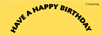
When the same type is placed on a curve, the spacing becomes uneven and too open in some places:

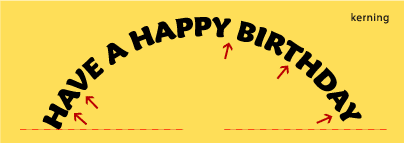
Reducing the tracking slightly improves the overall spacing, but there are still some uneven letter combinations:
Consistent spacing is finally achieved by adjusting the kerning between problematic letter pairs, as well as evening out the word spacing:
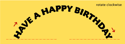
And finally, the type is rotated clockwise until it visually aligns on both ends:
I set my examples in Maiandra Pro. But if you’re using a connecting script, be prepared for special challenges. They might require lots of individual kerning to maintain the integrity of the connections without creating bumps and breaks.
Love type? Want to know more? Ilene Strizver conducts her acclaimed Gourmet Typography workshops internationally. For more information on attending one or bringing it to your company, organization, or school, go to her site, call The Type Studio at 203-227-5929, or email Ilene at in**@***********io.com. Sign up for her e-newsletter at www.thetypestudio.com.
This article was last modified on August 13, 2021
This article was first published on January 14, 2010
Commenting is easier and faster when you're logged in!

Recommended for you

How InDesign Understands Fonts
A daring exposé of the numerical truths behind all those characters you type.
When It's Safe to Use Free Fonts
Many of us are intrigued by the idea of free fonts. However, the reality can be...