

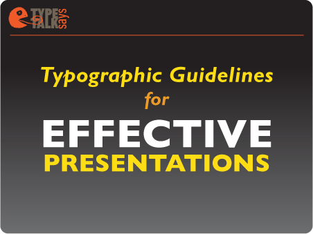
Q. Do you have any tips for creating visually successful presentations?
A. Whether you use a presentation application such as Microsoft Powerpoint and Apple Keynote or a multi-page PDF (as I do), the objective is the same: Engage the audience and support the main points of the speaker’s information. The goal is not to replicate your talk word-for-word, nor to present complicated charts, diagrams, detailed financials, and text-heavy slides. All of these will bore your audience to tears.
The following simple guidelines will help you create a presentation that will engage your audience:
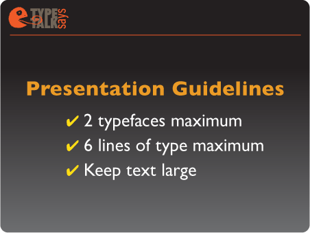
• Restrict your presentation to a maximum of two typefaces: one for headlines and subheads, another for text. Use strong fonts with a high degree of onscreen readability. Decorative and detailed fonts are harder to read onscreen and therefore less effective.
• Keep text large: 20 to 24 point minimum. Small text is hard to read on a screen, especially from a distance.
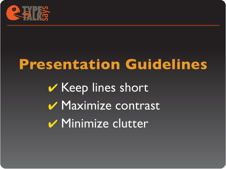
• Maximize contrast. When choosing color(s) for the background and/or the text, make sure the text stands out. Keep color scheme simple and consistent.
• Minimize clutter. Don’t place type on top of busy backgrounds or images.
• Restrict each slide to six lines of type or less. Present the highlights of your talk, not the actual text. More slides with less type are better than fewer, text-heavy slides.
• Keep lines short. Edit your thoughts to the fewest words possible; you can elaborate verbally.
I used one typeface, Gill Sans Pro, in different weights and versions for the body of the slides below. The contrasting colors pop, and lots of space contributes to clean, simple, readable type.
This article was last modified on February 18, 2021
This article was first published on July 1, 2010
Commenting is easier and faster when you're logged in!

Recommended for you

5 Great Script Fonts From Adobe Fonts
Need a great script font for use in your next InDesign project? Look no further!

TypeTalk: Steve Lambert’s Typography for Social Change
Steve Lambert cannot be categorized. Although I was first attracted to his intri...

New Book: Type Form & Function
Rockport Publishers has released Type Form & Function by Jason Tselentis. It...