
TypeTalk is a regular blog on typography. Post your questions and comments by clicking on the Comments icon above. If Ilene answers your question in the blog, you’ll receive one Official Creativepro.com T-Shirt!
Q. Why is there such a big space between the r and t in some typefaces, and what should be done about it?
A. A well-spaced font should have visually even negative spaces between all character combinations. This is achieved by a combination of properly designed letterforms and the font’s built-in spacing and kerning.
When certain characters are next to each other, such as the r and the t, the arm of the r and the crossbar of the t create a negative space that’s greater than you see between most other characters. To create better letter spacing, a skilled typeface designer may shorten the arm of the r and the left side of the t’s crossbar, and add a kern pair to bring the characters as close as possible while maintaining their readability.
However, some typefaces still appear to have too much space between the r and the t, or between other letter combinations, such as Ty or Yo. While it’s impractical for you to hand-space lots of text, you may want to custom-kern headlines, subheads, or other smaller blocks of copy. It’s usually impossible to make the spaces between these and some other character pairs match the rest of the typeface, especially in a condensed design. Even so, a little improvement will go a long way, especially in headlines.
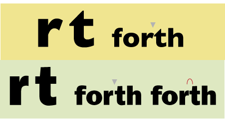
The glyph shapes of the r and t in Gill Sans Bold (upper) create a large negative space between them that cannot be improved with kerning. On the other hand, the shape and narrow width of the r in ITC Franklin Gothic Heavy (lower left) allow for less space between the two characters, which can even be improved with a bit of manual kerning (lower right).
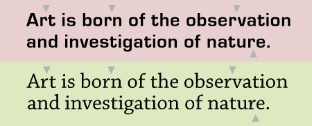
The shape and width of the r in Eurostile (upper) create more of a visual hole in the overall spacing than that of Chaparrel Pro (lower), which has a narrower r in relation to the other characters. Quote by Ben Shahn.
Love type? Want to know more? Ilene Strizver conducts her acclaimed Gourmet Typography workshops internationally. For more information on attending one or bringing it to your company, organization, or school, go to her site, call The Type Studio at 203-227-5929, or email Ilene at in**@***********io.com. Sign up for her e-newsletter at www.thetypestudio.com.
This article was last modified on January 3, 2022
This article was first published on March 26, 2009
Commenting is easier and faster when you're logged in!

Recommended for you
TypeTalk: The Best Fonts for Newsprint
TypeTalk is a regular blog on typography. Post your questions and comments by cl...

dot-font Book Free to Download
Back in 2007, longtime CreativePro.com author John D. Berry gathered a selection...
Tip of the Week: Turning Off Typekit
How to turn off Typekit font synching in the Adobe Creative Cloud app if you don...