

Scanning Around with Gene: Holy Word Balloons, Batman!
I was trying to figure out why so many ads I see in magazines from the 1930s through the 1950s feature multiple panels depicting conversations between family members, neighbors, and so on. These dialogs go so far as to feature word balloons, much like comic strips, only they’re applied to photographs.
So-called “typical” conversations have long been considered an effective way to draw people in to an advertising message, even before television came around and we could watch the actors speaking. With two exceptions, the images in today’s column date from 1934 to 1967.
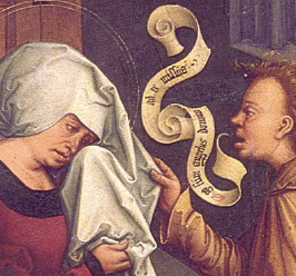
After a bit of research I discovered that “printed speech” techniques have been since the thirteenth century. Artists didn’t use balloons back then, but rather ribbons or scrolls, which often were shown originating at the mouth. Here’s an example from artist Bernhard Strigel (1460-1528).
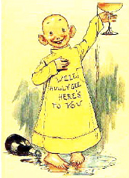
Skipping several centuries to the 1890s, the Yellow Kid comic strip used a technique where the speech was written on the character’s shirt.
Before long the Yellow Kid and other early comics had switchd from captions and other devices to drawing word balloons, mostly connected in one form or another directly to the speaker.
By the early twentieth century, word balloons were fairly common in America, though less prevalent in Europe and elsewhere. Commonalities emerged, such as directional tails to indicate which character was speaking, dotted tails to indicate thought, and tails pointing outside the frame to indicate off-screen speech. (In some modern manga comics, the tail points inward toward the text itself.)
At first most word balloons were straightforward conversation, but soon artists were using gimmicks to indicate thoughts, rage, and other emotions. Large or bold text indicates a character is speaking loudly. A big letter Z or a series of ZZZZs were an obvious choice to indicate that a character was sleeping. Multiple question marks or exclamation points easily conveyed doubt or surprise.

In some ways, we practice these same techniques in our email messages. We use ALL CAPS TO INDICATE IMPORTANCE, emoticons to get across emotions ;), abbreviations to save space and time, and so on.
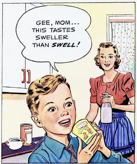
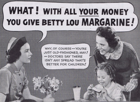
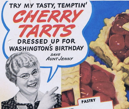
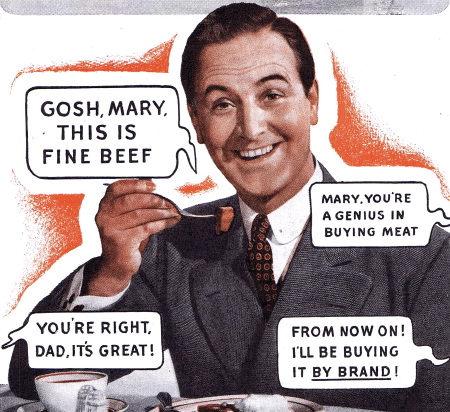
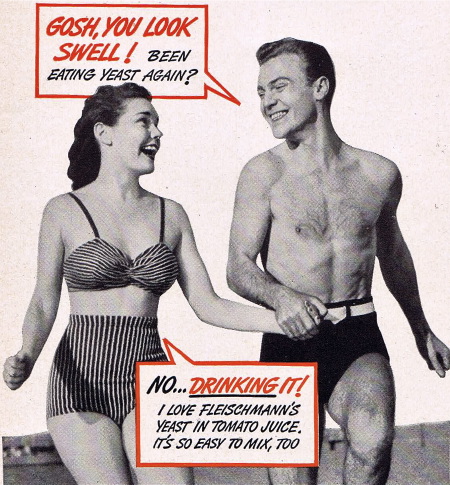
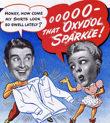
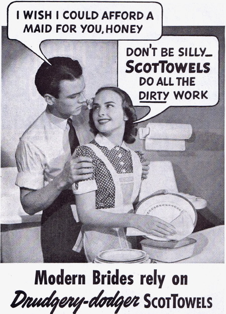
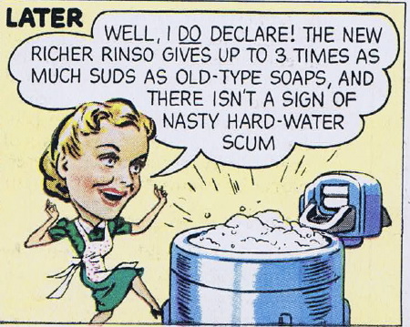
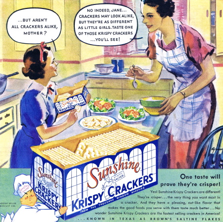
In advertising word balloons, the messaging was usually pretty straightforward, with brand names often given special treatment.
Conversation is a simple way to get a story across in a small space. Since we participate in conversations all the time, we are willing to fill in the blanks and make certain leaps that, in narrative, would need development.


Word-balloon conversation, either between characters or between the reader and the character in the ad, was an easy way make an impact in ads. There’s no reason these techniques can’t be used just as effectively today, but advertisers now are more inclined to feature product image or specifications in print, and reserve conversation and narration for radio and television.

You’ll notice that the majority of these word-balloon ads are lettered in all uppercase. This was common in both advertising and comics until fairly recently. The change may be due to the use of computer fonts to set balloon text these days — it’s harder to letter in upper and lowercase by hand.

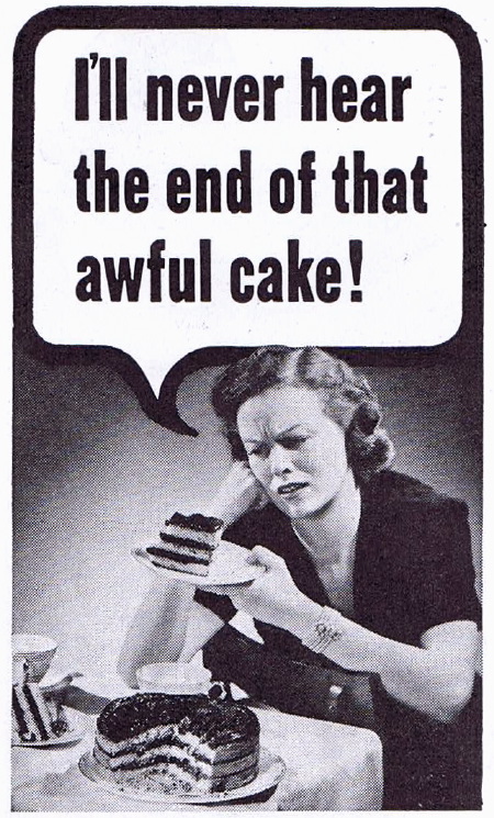
One thing that conversation-style advertising conveys very well is the social atmosphere of the time it was created. Trying to show racial characteristics, age, or gender by the use of slang and speech style may come off as racist or sexist today. And of course, you can’t help but get a chuckle out of the misplaced importance of things like the whiteness of sheets or the sparkle of a man’s shirt.


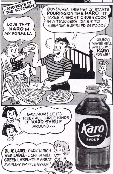
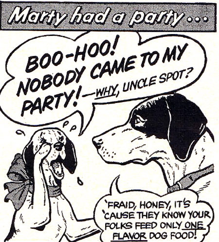
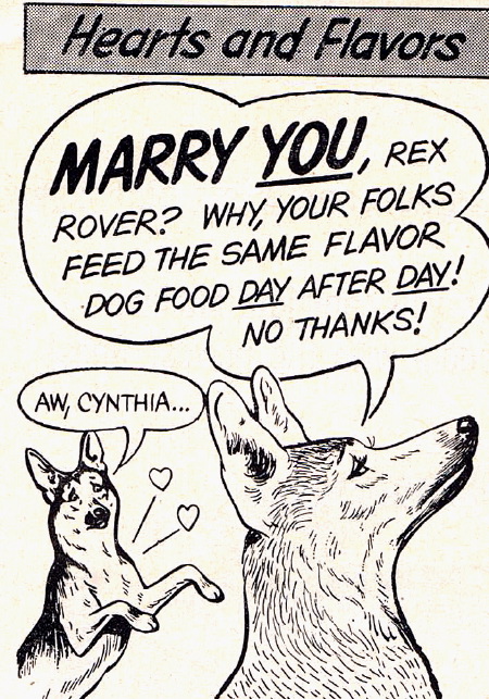
Even animals got into the act.
I’ve never had conversations like so many pictured here — I’m not sure anyone ever did. But by showing them as “average people” talking, advertisers created the feeling that if you weren’t having these sorts of conversations, maybe something was wrong. The more natural these conversations seemed, the more effective the ad.


I hope there’s a return to comic-like word balloons in advertising. Combine that technique with today’s no-holds-barred direct approach to communicating and you might end up with some interesting conversations like this:
Husband: What’s for dinner, honey?
Wife: Why are you asking me? How come you didn’t go to the store? Why is dinner somehow my responsibility?
Husband: I didn’t mean to…
Kid: You two are like a Fox News program — always screaming at each other. Face it, we’re going out for fast food anyway, so let’s just drive to Taco Bell and get it over with before you drink too much wine.
Dad and Mom together: Oh Junior, you’re so swell. Let’s go get a couple chalupas!
Dog: Woof woof!!!
I think you have a misprint. Those are Illuminated Manuscripts not Illustrated Manuscripts.
David Griffith
[email protected]
http://www.graphyx.com
How right you are, David! Blame me for that, not Gene.
Terri Stone
Editor in Chief, CreativePro.com
Just read the article and enjoy – you don’t have to proofread it.
Might? I think we are already there, your “ad” sounds so familiar… Oh I am longing for a McPherson doughnut now, they are so nice to eat when reading your blog.
Todeloo
anna-mi
When I taught advertising, I always showed the “Charles Atlas” ad – remember it? A perfect product demonstration using cartoons. I believe it mostly appeared in comic books (maybe it still does?)
Sheila J
… but “chalupas” took it over the top! This was simple fun and educational. I’m thinking about including word balloons…
Great article. All caps was the standard in comic books until very recently. Every sentence ended in an explanation point, as periods wouldn’t reproduce well due to poor printing techniques — it’s possible that the same principle applied to lower-case letters. Advertisers probably just followed the standard used in comic books.
-Daryl
a very useful resource regarding contemporary comics fonts, and the conventions for using them is the Blambot site.
https://www.blambot.com/
A lot of people are trying to break into comics these days and the site not only has commercial, but a lot of free fonts, as well as some pretty clear guidelines regarding the conventions, as they stand at the moment. It’s worth checking out.
I have researched print ads that appeared in popular magazines of 30s, 40s, and 50s. I enjoyed that trek into the past as much as I enjoyed this post of yours. Thank you.
Ricky
…were used by the Mayas. There exists a beautiful vase from the 1st millennium AD – I can’t lay my hands on a picture of it at the moment – showing Pauahtún, the god of writing, teaching a school class. In one vignette a “speech scroll” above his head with lines to his mouth contains a series of numbers: apparently a table in the book before him which he is reading to the students. In the other he is examining a student’s work, which in his speech scroll he describes as tatab, “badly draughted, untidy”.