
Occasionally, a garage sale find, thrift-shop discovery, or gifts from friends and family open little windows in time. Such is the case today as we look at a small stack of business cards brought back by a friend’s grandfather on his first trip to Europe in 1928. These cards, along with his passport and some souvenir post cards, were recently discovered in a long-forgotten box of paperwork. They provide a glimpse at the state of design in France, Italy, and Switzerland from a prosperous time between World Wars.
I don’t know if the trip was for business or pleasure, but the variety of cards would indicate an interest in everything from good food and fine antiques to women’s lingerie and marble statues. Click on any image for a larger version.


Before World War II there were essentially two kinds of cards: those that were “business” or “trade” cards, and personal cards referred to as “calling” cards. Typically, calling cards were smaller (approximately 1-1/2″x3″). and usually presented just a person’s name and possibly title (if they had one). These were given as a means of introduction and were common among the more well-to-do. Calling cards typically were engraved and of high quality.


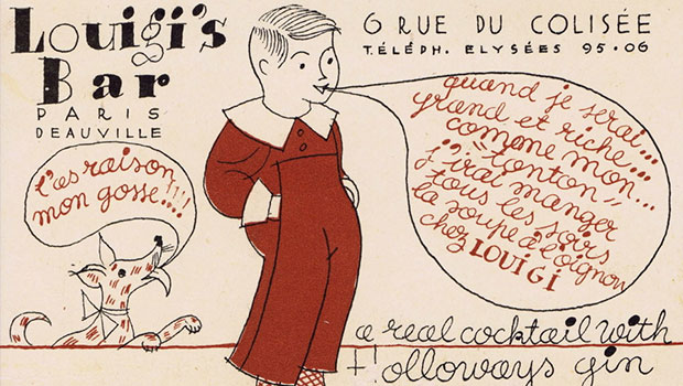
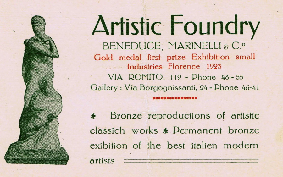
Business or trade cards, on the other hand, were much larger than they are today. Most of the cards shown here are about 3-12″x5″, double the size of today’s business cards and more like post cards. They served as both a take-away reference and an advertisement for the firm in question.


Many of the 1928 cards are hand-lettered, and those that are typeset were most likely composed by hand. The Linotype and similar “automated” type casting machines had been around a few decades but weren’t that common at general printers; they were more likely to be found at newspapers and other large-scale publishing businesses.


You’ll notice that many of these cards have an unusually large number of differing type styles combined together. This may be due less to design preferences than to the limited availability of type in various sizes at any particular printer. Sometimes the size needs dictated the style options.


It’s interesting to note that even though these tended to be more ornate times from a design standpoint, some of the more elegant cards are simple and straightforward, even by today’s standards. The card below is from Alfredo’s Restaurant in Rome, home of the original Fettuccine Alfredo.


I’m not positive that this assortment of cards is representative of the times, though I suspect so since they come from such a variety of businesses and geographic locations. Since all of these cards are printed on letterpress equipment, they have a texture that doesn’t come across well in the scans.


What strikes me with this collection is that, like today, there is such a wide variety of design styles. Some are complicated and cluttered and some are clean and elegant. So while Europe has certainly changed a great deal since 1928, maybe design hasn’t changed all that much.


This article was last modified on March 15, 2021
This article was first published on December 4, 2009
Commenting is easier and faster when you're logged in!

Recommended for you

CreativePro Conversations: Looking at the History of Type with Frank Romano
Learn the fascinating evolution of type from Gutenberg through webfonts with leg...

Communication Arts 7th Annual Typography Competition
Communication Arts magazine, a professional journal for those involved in visual...

Do Graphic Designers Need to Learn Coding to Be Competitive?
Many graphic designers find themselves feeling pressured in a more competitive m...