Scanning Around With Gene: When Letraset Was King
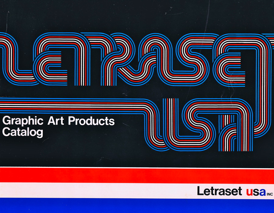
I was a freshman in college when I had my first confrontation with dry-transfer type. While every dry-transfer type encounter had a minimal likelihood of success, I somehow ended up with a decent-looking party invitation, which I remember distinctly was set in University Roman.
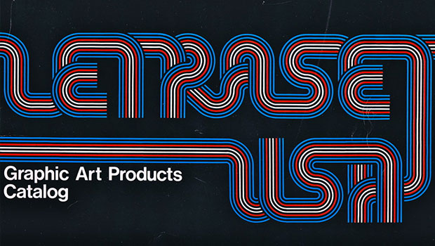
Fortunately, that first time I was using the best: dry-transfer sheets from Letraset, a British company that made (and still makes) a variety of graphic art supplies. It was the quality brand of the industry and you couldn’t call yourself professional without using at least one of the company’s products. The scans in today's column are from a 1970 and 1973 catalog. Click on any image for a larger version.
There were plenty of other brands of dry-transfer type -- Format, Chartpack, Meccanorma -- but Letraset was not only the best made, they had the nicest type selection, too. Many Letraset-exclusive designs have become standards of the type world.
You could tell serious graphic designer by whether they had a special tool just for burnishing dry-transfer type. A ball-point pen would do, but there were a number of dedicated products for the task, including what amounted to a big ball-point pen with no ink in it.
Letraset had special dry-transfer sheets just for architects. If your company was big enough, there were custom-made logo sheets.
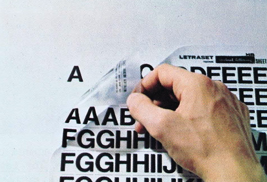
My favorite Letraset products were the clip-art sheets. Like almost all clip art, you couldn’t imagine ever actually using them, though I have to guess sometimes artists did, if only for comps. Let’s also not forget that in those days you were certain to burn through a lot of registration marks, which Letraset made in sheet and roll form.
If you were ultra-cool or worked at a big-enough design studio, you had your own special cabinet just for dry-transfer type. This was a good thing because the enemy of dry-transfer was dust or dirt of any kind. You had to treat the sheets with tender loving care or the letters would crack and peel.
But Letraset was a lot more than just dry-transfer products. The company made a wide range of graphic arts supplies, most of the sort that we don’t use anymore.
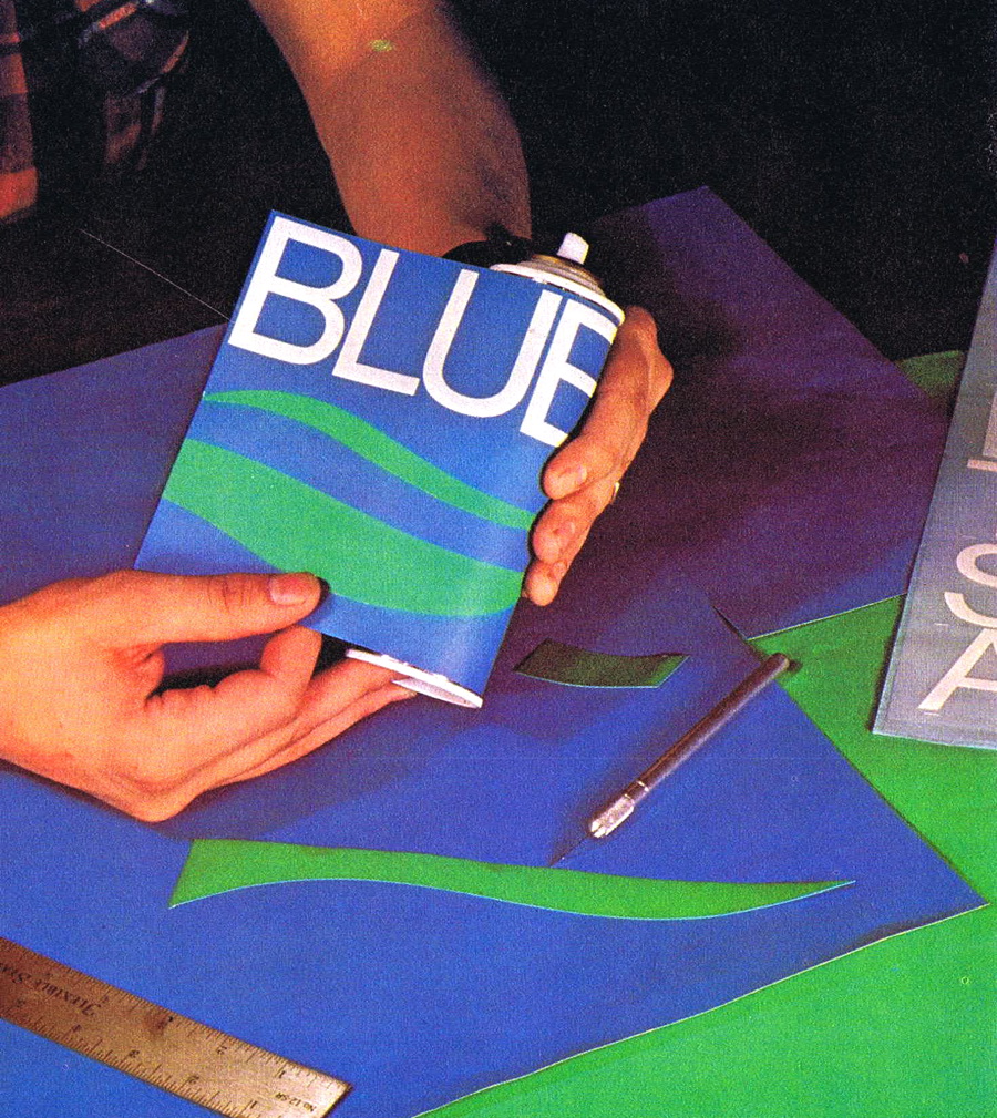
There were two distinct processes in those days: making "comps" and making camera-ready art. Now the art is the comp and vice versa, in most cases. In those days, though, showing art in color was not all that easy. Making colored type, for example, was a complex process that rarely worked, and printing in color required layers of acetate overlays, one for each color.
Letraset's products included border sheets, shading film, and various textures, which, when applied in enough layers, generated odd moiré patterns and printing disasters. The artist had to pick the resolution of the screens in advance based on the printing method being used.
No art studio would be complete without an assortment of toxic aerosol products, which were necessary for gluing and adding protective coatings to keep the dry-transfer type intact.
Letraset licensed the Pantone color library and manufactured a variety of Pantone products (colored art boards and transparent sheets, markers, etc.). Letraset was partially responsible for Pantone’s success in the graphic arts market.
Did you know that Letraset sold a viable Photoshop competitor, too? Go to page 2 to find out what it was called.
Letraset tried to make the transition to digital. At one time, it had a number of decent graphic-arts software, including a viable Photoshop competitor called Color Studio (licensed from Fractal Design) and a page-layout program called Ready, Set, Go! (licensed from Manhattan Graphics). But Letraset tried to sell its software and fonts through art stores, which didn’t turn out to be a successful model.
So the company never got traction in the modern graphic arts world. Apparently, though, Letraset has found a new life among Manga artists who use the company’s tonal shading sheets in the genre's distinctive artwork.
The company, which was once owned by office-supply giant Esselte Corporation, now appears to be independent and still makes dry-transfer type and other craft supplies.
I don’t miss having a drawer full of dry-transfer type. There were never enough letters, they never really worked well, and if you needed to center something, you either had to have a great eye or take a series of ultra-precise measurements. The only thing harder than getting dry-transfer type to stick on the paper was getting it off if you made a mistake, which almost always meant starting from scratch.
On the plus side, using one-letter-at-a-time dry-transfer type taught you a lot about letter spacing and kerning, not to mention how to swear.
Follow Gene on Twitter: https://twitter.com/SAWG


Comments
Guest (not verified)
Fri, 09/17/2010 - 10:39
Permalink
I remember Letraset
I fall in the gap, just after dry-transfer had faded away and replaced with very expensive filmsetters. I remember a few sheets of transfers laying about. It was obvious that there were never enough letters and that it had to have been a pain to use. I also remember Ready, Set, Go! We used it for about three years before adopting Quark. I saw a couple of years age that they had tried to revive it with a new version, but too little, too late I suppose.
Guest (not verified)
Fri, 09/17/2010 - 10:46
Permalink
Sheets
I still have a few sheets of Lettraset but would like a few more, especially with numbers. I hand number each year's worldview journal with lettraset rub-on numbers, so I'm running low on 2's and 0's, especially. Anyone have a few sets they'd like to pass on to someone who will use them? If so, email me at finaleyes@qwest.net.
Guest (not verified)
Fri, 09/17/2010 - 11:16
Permalink
When Letraset Was King
Thank you Gene, for this "way back" look at a form of "cold type" typesetting as we knew it then.
I was particularly struck by this article since I was employed by a Letraset competitor, Zipatone in Hillside Illinois, c. 1976. Us artists were given projects to "push the envelope" using Zipatone products. One artist meticulously used a hand paper punch to SINGLY punch, various self adhesive color sheets. Then one by one would peel the backing and place the dot to make a finished piece of artwork; several trees in a forest! Zipatone's version of Seurat stippling! In fact, it was published in a later catalogue.
We also made type drop shadows using black & white DTL of the same point size by rubbing down the black first then the white over it slightly up and to left. OUILA, an instant drop shadow!
Another product was a DTL sheet called Cook's Circle designed by the Art Director, Ben Cook. This was a set of tapered alphabets set in concentric circles. A center point was given on the sheet and a push pin used to hold it on-center. One one letter was rubbed down, you simply spun the sheet on the center point to the next letter. With a little cut and paste (rubber cement) you could create type in circles for heads or graphic elements.
Zipatone prided itself on seamless transfer without sheets drying up. In mid 70s, Zipatone hired a chemist to research different adhesives and transfer agents. If I recall, he was successful and found a solution. In fact, I still have some sheets which transfer perfectly today as well as the 70s when they were produced.
We easily removed unwanted letters with masking tape or a rubber cement pick-up. I personally had about 1000 sheets catalogued in alpha order! The sheets were silk screened 4-up daily. And like any printing job the run had to be proofed before hitting GO button. These sheets were tested (transferred) on each corner and in center. If the sheet transferred well, the press was off and running. These "transferred" sheets were discarded to a box near the press and eventually discarded in dumpster. Some of us artists would gather these unwanted sheets for our own personal files.
As a transition and epilogue, University Roman was my favorite DTL sheet. The Art Director, however, enlightened me that UR was very similar to and old font called Celtic. A few changes like moving the center bar of the UC "E," or adding some ligatures or alternates. However, I was "inspired" by UR to create my only font for Zipatone named Chic. I still have some sheets in my file for posterity sake. And Zipatone also went digital for awhile before closing its manufacturing plant. They marketed & digitized some of the old DTL fonts on floppy disks. Chic was included in this product endeavor. Also, Adobe did offer Chic for several years. I have yet to find a digital format for Chic.
Lastly, as computers entered the design world, things done by hand (ie, DTL) faded in the past. However, my traditional training was called into the 3rd millennium in 2008 when I accepted the position of Sign Artist with Trader Joe's. Yes, the interview was conducted with a heavily dusted OFF, old fashioned portfolio of hand rendered specimens! Being a traditional calligrapher for near 4 decades, I convinced the Captain I could "do Joesy" lettering. Today is my 2nd anniversary, doing Joesy the old-fasioned way, by hand!"
Joesy Jer at TJs
joejer.blogspot.com
TJs NB Wall Art
nbwallint.blogspot.com
Cheers,
Gerald (Jerry) Moscato/Principal
Moscato Design
moscatodesign.blogspot.com
Guest (not verified)
Fri, 09/17/2010 - 11:57
Permalink
Wow, that takes me back!
I first used Letraset 26 years ago whilst training to be an artworker in a design consultancy. These images are all a blast from the past for me.
That's where I learned all about typesetting and using Letraset helped me understand so much more about type than I ever thought I could know.
Guest (not verified)
Fri, 09/17/2010 - 12:23
Permalink
My College Job
While I was going through art school I worked at a local graphic arts store. Mostly because of the 40% discount on supplies. My job was running the type counter and keeping the inventory of sheets in stock. It was a good way to meet people in the industry and see the impact the computer was beginning to have on our business. I have to say though I had way too many high school kids come in to buy 6pt Helvetica for fake IDs. (for some reason, we seemed to constantly be out of stock when they came in ;-)
When I graduated and moved to the professional world I had to learn Color Studio, Photoshop and Studio 8 along with other "Paint" programs because the industry hadn't yet decided that Photoshop was the Killer App.
I still have rub off type from back then. It's dry and flakey and doesn't stick real well anymore. I'm glad Letraset made it though, I was never good at hand rendering type on comps and this definitely sped the process up until the Computer became a mainstay.
It's funny to think the things that are now standards had to fight for their place in the industry at one time. Pagemaker, Quark, Ventura Publisher, Ready set go, they all were unknowns at one time.
Great article, thanks for the trip in the way back machine.
Guest (not verified)
Fri, 09/17/2010 - 22:46
Permalink
Blast from the Past
This article was like a real blast from the past. I recently retired from a design position that I began 32 years ago. We used Letraset and I had one of those fancy burnishers and the cabinet for storing the lettering sheets.
During those 32 years I saw a lot of changes. When computers came along, we couldn't determine which to adopt - PageMaker or Ventura Publisher (owned by Xerox at the time) so we bought both. We decided to continue with Ventura and were happy with it for a long time. In fact, it could perform some functions that InDesign still cannot do.
After 32 years I decided to retire and become my own boss, and LOVE it. Freelancers are so lucky now because we don't require as much hardware as in the earlier years, and we can be much more productive - time is money.
Guest (not verified)
Tue, 09/21/2010 - 14:49
Permalink
Takes me back
I kinda miss all this. These accoutrements lent graphic design a sense of craft -- traditional methods practiced on the board made me feel a mastery of the materials quite different from facility on the Mac. The pens, inks, papers, films, tapes, etc. were (still are) very appealing to me.
I do love my Mac, though.
Guest (not verified)
Tue, 09/21/2010 - 15:57
Permalink
Letraset had Fabulous Type Posters
Letraset was wonderful. Every design studio would have one of the wonderful large Letraset type posters on the wall. Letraset type catalogs could inspire logo design and then facilitate the comping process. I miss the hand work and skill required to do comps. I don't miss specing type and waiting for it to come back and then have changes after it was all pasted up into the final mechanical. Life goes on. It just doesn't feel as much like 'art' anymore.
trd2u
Tue, 09/21/2010 - 15:59
Permalink
Young Uns Don't Know What They're Missin'
Ahhh...the good ol' days....many long hours spent doing comps with Pantone paper, transfer type, spray mount, etc. etc. And, boy, Gene, you're right about the swearing! Seriously, I used to LOVE getting updated Letraset catalogs to see what new fonts may have been added (kind of like the equivalent of a kid getting the Sears "wish book"). I also used to use those catalogs as guides for hand lettering stuff, too.
I have also had the "pleasure" of having to use other products like the Pantone films as well as competitors such as Zipatone. Some days I would come home from work and find little pieces of it (and amberlith) in the weirdest places in my clothing.
When desktop publishing came along, I kept thinking to myself I would've given my eye-teeth for a Mac back in those days, but then again, I wouldn't have such fond memories. :)
Guest (not verified)
Tue, 09/21/2010 - 17:11
Permalink
Robert's Art Supply
Robert's Art Supply, know it well, bought my Letraset from them for many years.
Guest (not verified)
Tue, 09/21/2010 - 18:58
Permalink
Letraset
Yikes - I still have a drawer full and my burnisher!! AND, I think I still have that catalog somewhere -
Photoshop was pure magic.
Guest (not verified)
Tue, 09/21/2010 - 19:09
Permalink
There were never enough letters,
As you said, Gene, there were never enough letters, but Letraset taught me so much about type: on that rush job at night or on weekends when all the art stores were closed, I found out how to correctly angle the cuts to make a sans font O into a C or a n into an r, and many more.
Gordon Woolf
gordonwoolf.com
Guest (not verified)
Tue, 09/21/2010 - 19:13
Permalink
The very first Letraset
And I nearly fogot. Before dry transfer, Letraset produced their very first type sheets as old fashioned transfers that you had to float off in water. Anyone still have any of those?
Gordon Woolf
gordonwoolf.com
Guest (not verified)
Tue, 09/21/2010 - 21:17
Permalink
Letraset
I miss my burnisher!
Guest (not verified)
Wed, 09/22/2010 - 05:28
Permalink
A trip down memory lane...
How things have changed, from Letraset to Font Book, from Omnicrom and Magic Markers to the Mac...
Typesetting was more of an Art, then.
I still have cabinets of the stuff, waiting for an excuse...
Guest (not verified)
Wed, 09/22/2010 - 08:28
Permalink
Admitting My Age
I too remember all these products. Catch 22 for me: 1) I'm glad we don't have to use these products anymore vs 2) I miss using my hands to create designs.
Guest (not verified)
Wed, 09/22/2010 - 12:46
Permalink
Yep, I've been around
Remember using their pinstripes? And trying to keep a line perfectly straight with no warping because someone had left the material in a hot car? I loved learning the "real way" to set type and making comps, but I don't miss darkrooms, faulty Rapidograph pens splotching and missing key rub-on letters...
The first time I set up type in Ventura Publisher I was hooked; when Aldus came out with PageMaker I was in love. Our tools keep evolving and that's what helps keep it all so much fun and never boring.
Cheers!
Guest (not verified)
Wed, 09/22/2010 - 18:37
Permalink
Letraset was formational for me
This is great, Gene! It was a few sheets of Letraset and Format (which I remember as having to cut out with an x-acto blade, not burnish) as a gift from my step-mom when I was a kid in the late 70s that started me down this crazy career in publishing.
The patterns were the most wonderful thing for me, but I hated that you could not change them -- they were the way they were. So when I learned PostScript in the 80s, I wrote an Aldus Freehand third-party product called psFX. Many years later, the patterns later came back as the InDesign plug-in PatternMaker (from teacup software).
--david blatner, indesignsecrets.com
Guest (not verified)
Fri, 09/24/2010 - 00:49
Permalink
Nostalgic
Postscript killed Letraset stars
Guest (not verified)
Sun, 09/26/2010 - 13:23
Permalink
I remember...
Used to use Letraset to make one-off front panels for electronics stuff during the mid 80s, and used it for labeling PCB artwork. As you said - the first few efforts weren't great - pull off mistakes with a bit of tape and do it again. Lacquer over the finished item and it looked very smart.
I used to have to do the metal-bashing, too - it was a small firm!
Guest (not verified)
Mon, 10/04/2010 - 05:54
Permalink
Letraset made me want to be a designer
I remember as a penniless art student drooling over the Letraset catalogue and going into my local reprographics store to sniff the magic markers - The idea of one day having a drawing board, a full set of letraset type, shading and image transfers alongside a complete set of magic markers seemed almost impossibly glamourous - that it still seems glamourous in a Mad Men kind of way just twists my head around - when did it become "retro"?
Guest (not verified)
Mon, 10/04/2010 - 11:31
Permalink
Letraset
I still talk to my designers about transfer type... Don't forget "PRESSTYPE" . I remember yelling at the Letraset rep about how there company was ripping off the design student. It went from $3.00 to $5.00 then to $7.00 plus a sheet. Don't forget about making letters from other letters in the middle of the night! Computers are great but you don't "feel " the font like the old days!
Guest (not verified)
Mon, 10/04/2010 - 12:42
Permalink
Letraset is to blame!
I think the genesis of my addiction to scrapbooking can be traced back to Lettraset.
Guest (not verified)
Mon, 10/04/2010 - 14:11
Permalink
thanks for sharing!
very good to see this scans, for me it´s truly a family moment, as my father used to work making paste-ups in the 80s.
I have this photo from some Letraset type specimen to share with you:
Guest (not verified)
Mon, 10/04/2010 - 14:18
Permalink
Those were the days...
I remember paging through the Letraset catalogue to find the proper half-tone or font...sitting in the fumes of hot wax. A great memory!
Guest (not verified)
Mon, 10/04/2010 - 20:43
Permalink
Letraset! Wow!
LOL! I still have mine from my cartography course in uni - back in the late 80s. Then I used them everywhere.
Guest (not verified)
Tue, 10/05/2010 - 08:25
Permalink
Letraset
I made some fake notes on letterhead back-in-the-day... was great stuff...
Guest (not verified)
Thu, 10/07/2010 - 09:16
Permalink
Font sheet
Looking at the font sheet, a few things strike me. Camellia looks and feels and smells like a mid-70s porn film, of the sophisticated variety; Data 70 was blown out of Earth's orbit in September 1999; Oxford makes me think of the Open University; the whole thing reminds me of Gary Glitter.
I'm surprised it doesn't have the "diagonal shattered glass effect" font that was popular on album covers. I remember seeing STOP in the 1980s, so it's the only font that isn't forty years out of date (it's thirty years out of date). Was this their special effects sheet, or were these fonts that people were expected to use? They're... characterful at least.
Guest (not verified)
Tue, 10/26/2010 - 12:10
Permalink
Letraset memories
I,too, started using Letraset in college. I still have a wood storage box full of sheets. I saved two catalogs from the 1980s. Some of them still release from the carrier. I just found a Colortag system at a Goodwill store with supplies. Hope is still works. Fun!
Guest (not verified)
Wed, 11/24/2010 - 12:46
Permalink
hilarious!
this post brought back many memories* of university training, and the first few years out.
http://www.flickr.com/photos/larrygassan/4708232580/in/photostream/
*painful mainly
thanks!
Guest (not verified)
Wed, 12/08/2010 - 19:17
Permalink
Thanks Jerry
When I read the photo caption claiming Letraset was the best, I thought to myself "No way." I don't know what it was about Letraset's carrier base, or perhaps it was their adhesive, that made getting the letters off difficult in large point sizes. The top of the letter would come off, but the carrier would be so distorted from burnishing that the letter would break. Then it was heck trying to get the letter to fit without a hairline crack.
I always preferred Zipatone, however they couldn't match Letraset's library of fonts.
While we're reminiscing about cold type, how about creating those missing letters using the parts of the leftovers. Now THERE was a lesson in typography!
Guest (not verified)
Thu, 12/09/2010 - 08:42
Permalink
Letraset
In the late 80's we used to have custom made colour transfers made for client comps.
As far as Letraset software goes "Color Studio" was more than a match for PhotoShop, its colour management was better and it performed better with large files. It did not have the plugin following PhotoShop had.
Letra Studio was a powerful type manipulation tool, but unfortunately initially it could only use Letraset fonts.
The big downfall of Letrasets computer products were two fold. They were late to market so studios had already invested in other tools. Also DesignStudio as they renamed "Ready, Set, Go" was a piece of junk compared to Quark Express.
Other Studio products included, FontStudio (best font design package of the time), ImageStudio (for grayscale images), LetraFont Type Library (in a proprietary font format later in type 1)
Wow thats a blast from the past!
Guest (not verified)
Wed, 02/23/2011 - 13:12
Permalink
I used them all
I think I used everything Letraset produced from the dry transfer lettering to type manipulation software. Remember using graduated tones without needing an airbrush? Come to think of it, I even used some kind of airbrush contraption they created for their markers. Really thought they missed an opportunity not digitizing more of their products.
Guest (not verified)
Sat, 03/05/2011 - 01:31
Permalink
letraset
I still have my letraset set books from way back when...
Guest (not verified)
Tue, 03/22/2011 - 11:10
Permalink
I remember Letraset!
I used to produce a mostly Star Trek fanzine back in the 70's and early 80's with a friend. Our first issue was done on a Roneo Mimeograph, with some offset printed art, but our later issues were printed by a local company. And I typed things up on a Remington SR101 electric typewrite, essentially an IBM Selectric clone. And we used a LOT of Letraset "press type" as we called it. So I do indeed remember that stuff. Actually rather fondly.
Guest (not verified)
Tue, 03/22/2011 - 11:45
Permalink
Letraset collection
If you ever get to London, visit the St. Bride Printing Library on Fleet Street. In the bowels of that old building, they have every Letraset page ever created. It's an amazing collection, one I would gladly have taken off their hands if they'd asked me to.
Guest (not verified)
Tue, 03/22/2011 - 12:05
Permalink
Good ol' Gene
Hey if CP are gonna repeat stuff then at least this is the cream of the crop.
Guest (not verified)
Tue, 03/22/2011 - 18:07
Permalink
Fond Memories
I started doing mechanical artwork in 1974. Comps were always my favorite because they allowed for no error. And they had COLOUR (amazing how thirsty your eye can become). The pictures above are still SOOO familiar to me. Great to see them again. What warm memories. I don't wish for us to go back, but I can still get wistfull....
Guest (not verified)
Tue, 03/22/2011 - 19:31
Permalink
I remember!
I sure do remember Letraset; I used various sheets, both lettering and boarders during my college days! Talk about time consuming, but sure beat the alternative and looked good too.
Guest (not verified)
Wed, 03/23/2011 - 22:11
Permalink
Letraset, Waxing machines - Fun and Games
Boy, what a trip down memory lane . . .
I sure remember many late-night cussing sessions, trying to rub down fine serifs from an aged, buckled sheet of Letraset.
And counting characters on the sheet to make sure I had enough of each to set up a particular headline . . .
And cutting out and aligning accurate tint-blocks with a number-9 scalpel blade . . .
The waxing machine was a VERY trippy piece of kit. I distinctly recall one occasion where our courier picked up a bunch of finished art (wax-fixed onto good ol' Bainbridge Board, the one with the 1-millimetre blue grid for true PRECISION paste-up!!) to deliver to the film-house. Bear in mind this is happening in Australia, mid-summer, before car air-conditioning. The courier transported the artwork on the back parcel-shelf of his vehicle, in direct sunlight, across town in peak-hour traffic, to meet a VERY tight deadline. By the time it arrived at the other end, when the parcel was opened, a confetti shower of greasy curled-up correction patches fell out of the bag . . .
So the ad agency I worked at actually hired an industrial chemist to come up with the killer "ultra-sticky" wax formula. This eccentric genius would come in on a weekly basis with his latest version. The art department staff were like dope-fiends waiting for our dealer to deliver hashish. We'd fire up the waxing machine, wait for it to melt a block of this gunge and give it a test-run pasting-up a bunch of one-line corrections on some galleys, followed by our verdict. I can still see his crestfallen face as we'd say, "Nup, try again". After about 18 weeks of this, he showed up with his ALL-TIME SUPER-STICKY SECRET BEESWAX FORMULA version. It was sensational - NOTHING could make those corrections fall off. All good . . . as long as the client didn't need to make any FURTHER amendments to the text . . .
Working these days with InDesign on a nice fast Mac, I relish explaining to young designers that making sure your text-blocks are truly horizontal isn't even an issue, like it was when you had to work on a poorly-adjusted drafting desk with a slimy wax-backed type galley . . .
Certainly was fun and games. I don't miss The Old Days. Much.
bruce272
Fri, 03/25/2011 - 10:06
Permalink
Letraset
In the40+ years in the "business", I have learned that you can't spray Letraset with Krylon's "Crystal Clear", unless you enjoy seeing hours of work shrinking into nothing on the page.
ovelky
Fri, 03/25/2011 - 15:56
Permalink
Letraset
Gene,
I remember Letraset well and used many a page of it as a TV Art Director in the late 1960's to 70's. And I've got another one for you!—have you ever heard of a Kensol Hot Press (I think I'm spelling Kensol right). I used it a lot back in those days to create "cam cards" for local TV ads and show openings. It used lead type set upside-down and backwards one letter at a time, which was then pressed onto colored illustration board using a thin film of colored pigment mylar in between that transfered the heated letters onto the art board. I burnt my fingers many a time picking up still-hot type, but the effects were as good as one could get and still create the type in all kinds of (mostly primary) colors. I'm a big fan of "Scanning Around with Gene." I read every article and I'd love to see you do an article about this old amazing machine.
Gene Doyle
"Creative Guru to the Huddled Masses Since 1967"
Guest (not verified)
Fri, 08/26/2011 - 19:50
Permalink
I remember those!
I well remember several of these sheets. We even had a few of those clip-art sheets kicking around, although I don't recall anyone actually using one.
Guest (not verified)
Wed, 09/07/2011 - 07:59
Permalink
Fast forward to the '80s
Hey Gene,
Do you remember when Letraset brought out that Letrajet Air Marker?
I first came across it in '86.
Guest (not verified)
Fri, 09/09/2011 - 00:26
Permalink
thank you so much for this
thank you so much for this little trip back to the sticky, tedious and often toxic world of my design beginnings. i'd almost forgotten many of these torture devices. what fun!
Guest (not verified)
Sat, 11/12/2011 - 03:44
Permalink
RIP Russell Jack
What a nice find... My Dad died two years ago - he was a graphic artist (he preferred to call himself a commercial artist) who trained in the late 1940s and worked right up until the early 80s in New Zealand. I'm trying to decide what to do with his extensive stash of Letraset, complete with the cabinets! Have pulled out some sheets and his burnishers as keepsakes.
Guest (not verified)
Fri, 12/16/2011 - 16:12
Permalink
Help
Hi
I am a graphic design student and I am currently struggling with my dissertation titled;
Is technology making craft based designers less skilled?
I am focusing my essay on the craft of typographers.
I would really appreciate your background and knowledge on the subject,
When did you use typography/text/fonts?
What did you produce/create?
Did you use letraset? What where the pros , cons, restrictions, benefits?
How was it done before letraset?
Do you use programs now?, what are the befits?
Do you think today’s generation of designers are less skilled than your generation?
My Tutor told me about this designer that made wedding invitations that where produced with hand rendered typefaces.
As technology advanced he used it to his advantage, he still created a unique typeface for his clients invitations
but scanned the type into a software programme to mass produce, then hand rendering the names to give it the personal touch.
This was a good example of how he used technology to be more beneficial and save time, do you have any similar experiences?
Truly interested and grateful for any form of response
Guest (not verified)
Sat, 05/12/2012 - 15:00
Permalink
Missed out
Born in the 80's. And got serious about design in the 2000's. I've never touched Letraset, but it looks like fun. I wouldn't want to burnish type 40 hours per week, but I'd like to play with it, for the experience. -Phillip
Guest (not verified)
Wed, 05/16/2012 - 00:53
Permalink
Stat machines
In the mid 80s, I worked in the LetraSet department of The Art Store in Pasadena California. I was also in charge of running the stat machine which allowed logo makers and graphic designers to get a crisp photo image of the logos they created using the LetraSet kits. I can't remember the exact name of the machine, but it was a reverse projection machine that had to filled with chemicals and and we wore heavy gloves to run the thing. I loved it because I developed true skill for running images.
Do you know the machine? What was it called?
Guest (not verified)
Sun, 05/20/2012 - 07:22
Permalink
Thanks for this
Oh the wonderful nostalgia! I had such a huge collection of sheets, Letraset when I could afford them, cheaper rivals when I couldn't, and lost the lot while moving rooms at college in 1988. I was gutted.