

TypeTalk: A Blizzard of White-Space Characters
Q. I understand nonbreaking spaces after reading your post last week about them, but what are all those other white-space options in InDesign and Quark?
A. Both InDesign CS3 and 4 and Quark 7 and 8 have a collection of white-space characters intended to help you fine-tune your work. Some of these non-printing characters are more useful than others.
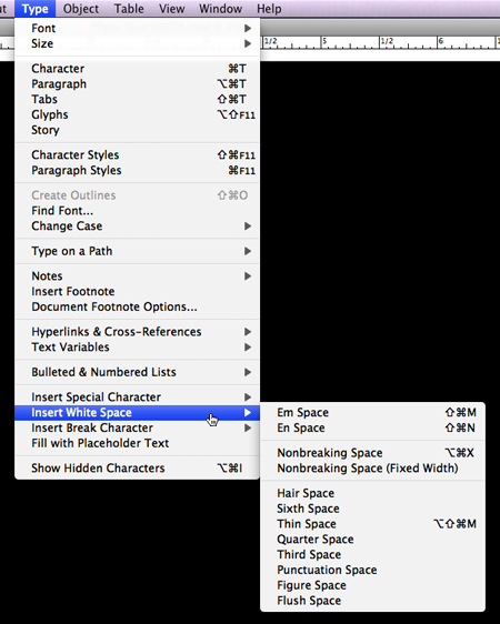
Em Space: Equal in width to the size of the type. For instance, in 12 point type, an em space is 12 points wide.
En Space: One half the width of an em space.
Third Space or 3-per-Em-Space: One third the width of an em space.
Quarter Space or 4-per-Em-Space: One fourth the width of an em space.
Sixth Space or 6-per-Em-Space: One sixth the width of an em space.
Thin Space: One eighth the width of an em space. Often used on either side of an em or en dash (although I prefer the kern function for this).
Hair Space: One twenty fourth the width of an em space.
Flush Space: Adds a variable amount of space to the last line of a fully justified paragraph, useful for justifying text in the last line.
Figure Space: Same width as a tabular numeral in the typeface. Can be used to help align numbers in financial tables.
Punctuation Space: Same width as the exclamation point, period, or colon in the typeface.
Nonbreaking Space or Word Joiner: When placed between two words, it prevents them from being broken at the end of a line. It’s flexible in that it can expand or compress in justified type. For more information, read this post.
Nonbreaking Space (Fixed Width) : The same as the above, but it doesn’t expand or compress in justified text.
InDesign’s white spaces are located in the Type > Insert White Space menu.
QuarkXPress
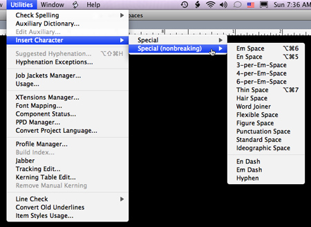
Zero Width Space: A space of no width, useful (for instance) when converting to diagonal fractions in OpenType to differentiate between values such as 21/8 (twenty-one eighths) and 2 1/8 (two and one eighth).
Ideographic Space: The fixed, full width of a character in fonts that are ideographic, such as Japanese, where all characters take up the same amount of space.
Standard Space: A flexible word space that may be altered based on the H&J settings.
Quark’s white spaces are found under Utilities > Insert Character > Special or Special (nonbreaking). Be sure to select a text box or insert your cursor to activate these choices.
thank you so much for spreading the ‘white space’ word. I can’t imagine life without these little gems and yet it’s quite hard to get the new generation to appeciate their value.
I think the real key in getting people to use these spaces is to explain why multiple space bands should be avoided.
insert your CURSER?
Thanks, Tim!
Terri Stone
Editor in Chief, CreativePro.com
thank you so much for spreading the ‘white space’ word. I can’t imagine life without these little gems and yet it’s quite hard to get the new generation to appeciate their value
sesli sohbet sesli chat