

TypeTalk: Justified Text

TypeTalk is a regular blog on typography. Post your questions and comments by clicking on the Comments icon above. If Ilene answers your question in the blog, you’ll receive one Official Creativepro.com T-Shirt!
Q. I see so much bad justified text that it makes me scared to try it. Are there rules for setting good justified text?
A. Justified type can look clean, classy, and elegant when set appropriately; when carelessly or inappropriately set, it can result in text with gaping holes, loosely spaced lines, and rivers of white space — all considered amateurish and in poor typographic taste.
While all design applications have default settings for justified type, this doesn’t guarantee that type will look good. Here are some of the major factors that affect justified type:
* Character count. Good-looking justified text maintains the color and texture of the unjustified version; that is, letter and word spacing are not squeezed and stretched to extremes to align both margins. Character proportions should never be altered. The more characters in a line of type (this includes word spaces), the easier it is to attain acceptable justification. The number of characters per line is dependent on the point size of the type, style and width of the font used, and as the column width. Having said that, all of these factors are affected by the…
* Word length pattern. If your text has a lot of large words, such as medical or pharmaceutical copy and German-language copy, there are fewer options for the application to break a line and/or hyphenate. In this case, the character count per line might need to be larger for optimum results, or your text will have too much…
* Hyphenation. An application’s hyphenation setting is a contributing factor to the look of justified text, as well as its readability, but unfortunately, one’s gain is often the other’s loss. The default hyphenation setting of most design software usually allows for two-letter hyphenations and for three or more hyphenations in a row, both of which are distasteful to many type professionals. For better readability, change the settings to a maximum of two hyphenations in a row and no less than three-letter breaks. Unfortunately, this gives your application fewer options and less flexibility when justifying type, but it will result in a more professional, readable result.
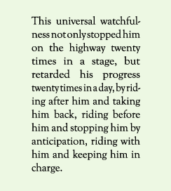
This example of justified text set on a narrow width contains gaping holes, squished lines, and rivers of white space.
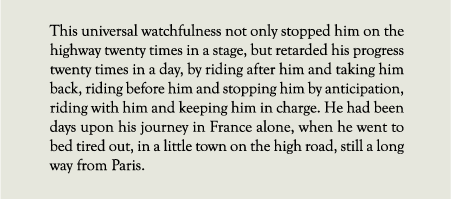
The same text set on a much wider width, while not perfect, has more even color and texture. Set in Goudy Old Style, excerpted from A Tale of Two Cities by Charles Dickens.
Ultimately, you might need to tweak your text to get it to look its best. This could mean making manual line-breaks to fix lines that are too open or too tight; making minor changes in the point size and/or line length; changing the default justification settings to get a better result (this can vary from setting to setting); or making minor edits to the copy (the dreaded solution!). If none of the above work, don’t justify it!
Love type? Want to know more? Ilene Strizver conducts her acclaimed Gourmet Typography workshops internationally. For more information on attending one or bringing it to your company, organization, or school, go to her site, call The Type Studio at 203-227-5929, or email Ilene at [email protected]. Sign up for her e-newsletter at www.thetypestudio.com.
does creativepro have or can’t it arrange a weekly topography fix? this is very informative and educational thanks a bunch to Ilene Strizver
AIGA recently launched the AIGA Design Archives, which is the largest searchable online archive of curated mp3 indir communication design selections in existence. The archives contain AIGA design exhibition catalogues from 1924-2007, oyunstar including the “Fifty Advertisements of the Year.”
I like your post & I will always be coming frequently to read more of your post. There is obviously a lot to know about this Your style of writing is really a joy to read.
PARKING NEW YORK
https://www.quikparkgarages.com/
Thanks For This Blog, was added to my bookmarks.