

TypeTalk: Point Size and Letter Spacing
TypeTalk is a regular blog on typography. Post your questions and comments by clicking on the Comments icon above. If Ilene answers your question in the blog, you’ll receive one Official Creativepro.com T-Shirt!
Q. Should the overall letter spacing of type change as its size gets larger or smaller?
A. Yes it should, and here’s why. The appearance of type changes optically with scale in its design characteristics as well as in the overall letter and word spacing. As type gets larger (especially typefaces intended for text), thins get thicker, design details appear clunkier, and the overall spacing looks too open. Conversely, as display type is set smaller, thin strokes and fine serifs begin to get very light and disappear, design details intended to be visible at larger sizes get lost, and the overall spacing starts to look too tight.
In the days of metal type when each point size was cut individually, minute adjustments were made to both the design and the spacing of each point size to compensate for this occurrence. But in today’s world of digital type, a font consists of one scalable outline that is used for all sizes.
To compensate for this optical illusion, use your software’s tracking feature to make gradual adjustments in the overall letter spacing as necessary to create an even color and texture. When setting display type, you may need to make some kerning adjustments to combinations that might have looked fine at small sizes but that appear too open at larger sizes.
One way in which some foundries are trying to address this issue is with fonts that are available in optical sizes. To read more check out the section “Optical Fonts Harken Back to Metal Type” in one of my previous columns.
Figure 1. The Helvetica Neue Thin font is spaced for display usage, so when you use it at smaller point sizes, increase the tracking gradually to create the appearance of even letter spacing. In the example below, the tracking for point sizes ranging from 14 to 86 point goes from +44 for the smallest size to zero for the largest in order to create optimum readability and even typographic color. (Note that the 14 point is difficult to accurately see on screen.)
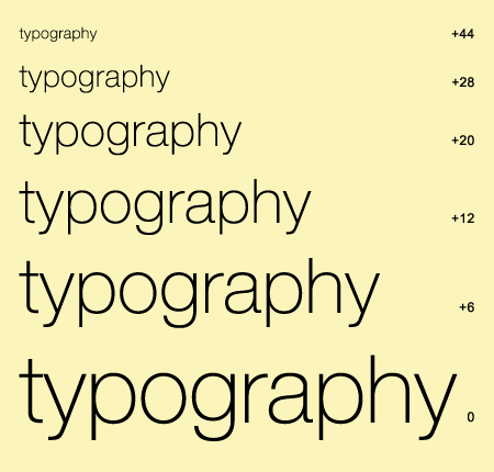
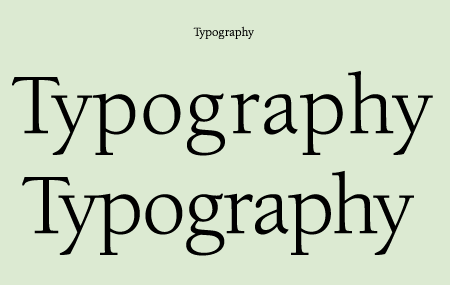
Figure 2. ITC Berkeley Oldstyle, a text typeface, looks fine (though difficult to see on screen) at 12 point in print (upper sample). But when used at a much larger size, it looks too open (middle sample). Reducing the tracking to -30 and adding some kern pairs makes for a much-improved appearance (lower sample).
Love type? Want to know more? Ilene Strizver conducts her acclaimed Gourmet Typography workshops internationally. For more information on attending one or bringing it to your company, organization, or school, go to her site, call The Type Studio at 203-227-5929, or email Ilene at [email protected]. Sign up for her e-newsletter at www.thetypestudio.com. You can also follow Ilene on Facebook and Twitter.
Great stuff! This is specially interesting for banners and ads.