

TypeTalk: Position Hyphens and Other Glyphs Properly

TypeTalk is a regular blog on typography. Post your questions and comments by clicking on the Comments icon above.
Q. In some printed phone numbers I see, the hyphen seems to be too low. Why is that, and should I fix it if it happens in my own projects?
A. Excellent observation! Here’s the scoop: The hyphen in a font is usually vertically positioned to look best next to lowercase characters. But when it appears next to or in-between cap-height characters, including the lining figures in phone numbers, the hyphen can look too low.
Should you fix it? That depends. You’ll have to change each instance manually, which may not be practical in long documents. But if it appears in a business card, brochure, annual report, invitation, or other material that is brief enough and important enough to make the change, most definitely raise it up using your software’s baseline shift function.
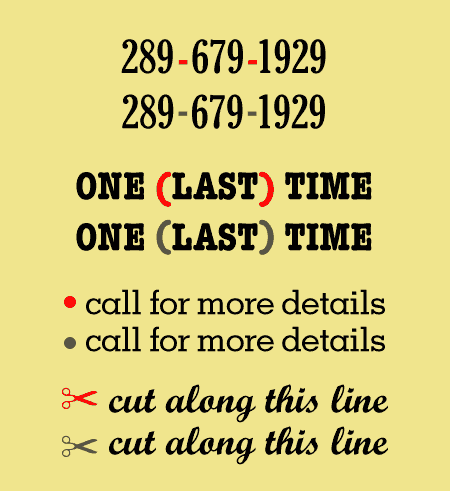
In each of these four examples, the glyphs in red in the upper versions of the pairs aren’t visually centered in relation to their neighboring elements. When this occurs, use the baseline shift feature of your software to raise or lower as necessary, as shown in the lower examples of each pair.
Other characters that might require slight tweaking of their vertical position include the following:
• Parentheses, braces, brackets, which can appear too low around caps or cap-height characters
• Bullets, dingbats, and symbols used as paragraph separators and end marks
• Registered, copyright, and trademark symbols
Taking the time to finesse your type in this manner makes for a much more professional look.
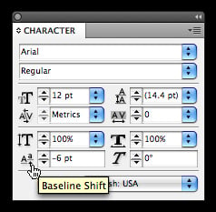
The Baseline Shift function is located in the Character palette in InDesign and Illustrator.
Love type? Want to know more? Ilene Strizver conducts her acclaimed Gourmet Typography workshops internationally. For more information on attending one or bringing it to your company, organization, or school, go to her site, call The Type Studio at 203-227-5929, or email Ilene at [email protected]. Sign up for her e-newsletter at www.thetypestudio.com.
Ilene. Good article. Hardly anyone does this and it is a fine, but great, point.
Jim