

TypeTalk: Is There an Optimum Line Length?
TypeTalk is a regular blog on typography. Post your questions and comments by clicking on the Comments icon above.
Q. Is there an optimum column width for text settings that makes the text easier to read?
A. When determining an appropriate column width for optimum readability, your primary consideration should be the average number of characters in the line. In general, 45 to 75 characters per line (don’t forget to include spaces) is an acceptable measure for continuous, unjustified text. Many fewer characters and you risk the creation of too many word-breaking hyphens, which reduce readability. Many more characters and the reader can easily get lost when going from the end of one line to the beginning of the next. We’ve all had the experience when reading very wide columns of text of jumping to the wrong line (either rereading the same line, or skipping a line or two) and getting totally lost, right?
With justified text, the number of characters per line should be on the high end to avoid too many hyphenations, unsightly holes, and rivers of white space in your text. There are other exceptions: captions that can run very narrow or very wide, and introductions, footnotes, and other kinds of text that tends to be set in wide column measures.
The following factors can contribute to how wide a text column of a particular character count will be:
• the typeface
• the point size
• the average word length
Fonts have variable “alphabet length”, which helps determine how many characters can fit on a line. The alphabet length is historically the width in points of the lowercase a through z. This measurement varies depending on the overall width of a typeface and the point size you choose.
Figure 1. Today’s software let you visually compare alphabet lengths of different typefaces (and sizes) easily and quickly, as shown below in these 24 point settings.
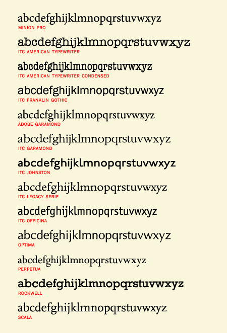
In the pre-digital days, you had to send type to a type shop for setting. Before you did, you measured the alphabet length by hand with a point/pica ruler, then determined the total depth of the typeset text. Today, you can visually compare the width of different typefaces to see which will give you the best economy of space for a given measure.
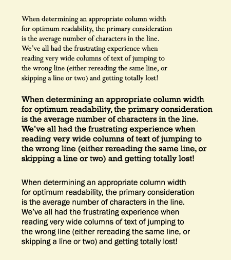
Figure 2. These three text blocks, set at 16 point, all have an average of 50 character per line, but the width of the columns vary with the font used. Set in Perpetua, Rockwell, and Franklin Gothic.
The final factor affecting the desirable number of characters per line is the nature of the actual text: for instance, medical and pharmaceutical text, as well as German language text, tend to have much longer words, which might require a larger character count per line (resulting in a wider measure) to avoid too many hyphenated words. On the other hand, text intended for young readers might have lots of short words, allowing for a shorter measure.
Love type? Want to know more? Ilene Strizver conducts her acclaimed Gourmet Typography workshops internationally. For more information on attending one or bringing it to your company, organization, or school, go to her site, call The Type Studio at 203-227-5929, or email Ilene at [email protected]. Sign up for her e-newsletter at www.thetypestudio.com.
Ilene Strizver provides very good examples and techniques with this ‘column width’ study. InDesign has opened the world of careful typography to all in this industry who care to study the fine points.
The contributions by Ilene Strizver in this goal are remarkable in their clarity and usefulness.
————–
An old man, a writer who likes people, living in the middle of the Pacific ocean near volcanoes, in tradewinds and soft bird songs.
I love reading Ilene’s type columns. I often learn something new, or learn a rationale I can explain to my clients for my typography choices. Sometimes when they see general rules and regulations like this from a type expert it legitimizes my recommendations to them and they can let go of their subjectivity or personal preferences in their feedback to me which often sabotages a good design or readability.
Keep up the great work.
Ginny Hull, Creative Director, Hull Graphic Design LLC
Have never figured out how different fonts of the same point size can vary so much in size. In the example of three blocks of text, all three are 16 point. Yet, the Perpetua block is very much smaller than the other two.
JJ
JJ, scroll down to the third query on this page for an explanation:
https://creativepro.com/article/typetalk-a-new-column-creativeprocom
Ilene
.. .. .. .. .. .. .. .. .. .. .. .. .. ..
T H E T Y P E S T U D I O
Westport, CT
203.227.5929
http://www.thetypestudio.com/
75 is too long! the optimum is 50 to 65 including spaces. In the past, the typesetters you talk about, called it two and half a-z’s that is 65 characters.
I remember having to ‘cast off’ back in the day and I still have my typescale. The proof is in the text length of this article – the lines are too long!
Olwen Bruce [email protected] for more info
I always used the rule-of-thumb an alphabet-and-a-half. I’d keyboard a thru z and then add to that a thru m. That usually worked for me. [This is coming from a Linotype operator who started in 1950.]
Patrick Leary / [email protected]