

TypeTalk: Metrics Versus Optical Kerning
Q. When setting up styles or formatting in Adobe InDesign, is it better to use Metrics or Optical kerning? Is it okay to mix them, such as Metrics for Headline and Optical for Body?
A. InDesign has two options for controlling automatic kerning.
The Metrics setting, which is the default, uses a font’s built-in kerning pairs. If the font has adequate kern pair tables (as do most fonts from major type foundries), this setting is usually the best choice, especially for text. (In Illustrator, the Metrics setting is called Auto.)
The Optical setting overrides a font’s built-in kern tables so that InDesign determines the spacing and kerning between all character pairs. This can be useful when a font has few or no built-in kern pairs or when the overall spacing seems uneven. However, the real value of the Optical setting is that it automatically adjusts the letter fit when you combine different fonts or type sizes (see below).
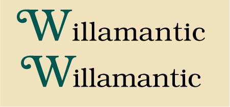
InDesign’s Optical kerning used for the Wi combination only (the rest of the word looks fine) improves the spacing between two different sizes of ITC Bookman Std.
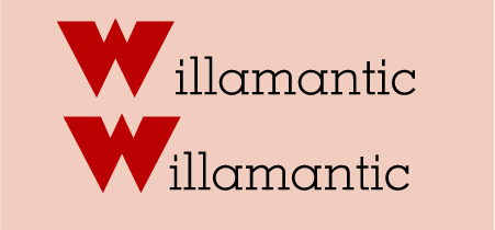
The Optical kerning setting can also be used to automatically kern letter combinations set in different typefaces. Here, the W is in Dolman; the rest of the word is set in Memphis. Manual kerning can be used on top of the Optical or Metrics setting if you want to make additional spacing changes.
So in answer to your question, while you can choose either Optical or Metrics kerning when creating style sheets or formatting text, your typefaces should determine which of the two to use—it’s a visual thing. And while you can mix Optical and Metrics kern settings, double-check the type’s appearance if you change fonts. Also remember that no matter which of these settings you use, you can always add manual kerns as needed.
Read more about the use of Optical spacing for figures.