

TypeTalk: How to Attract Attention With Pull Quotes

A pull quote is a key phrase, sentence, quotation or excerpt that is taken, or pulled from the text and reinserted in a layout, page or article in a graphic way. Its purpose is twofold: to attract attention by offering a teaser intended to draw the reader into the piece, as well as to add visual interest, excitement, and break up text-heavy content. Pull quotes are commonly used in magazines, book covers and interiors as chapter openers, brochures and annual reports, but can also be useful in ads, packaging, direct mail and marketing materials, posters, blogs and web sites. In addition, pull quotes can increase the skimmability of a long article.
The first step to creating one or more pull quotes is to find key text to use. Text suitable for pull quotes is often identified by the author or copy editor. But if not, you can do it yourself: Read the content carefully and identify some key copy that will interest and attract the reader. Any engaging text or phrases can be used, including actual quotations which can be powerful teasers when used as pull quotes.
The secret to successful pull quotes is how they are designed and integrated into the piece. They can be brief or lengthy, as long as they express a complete thought. Pull quote treatments can go from more conservative to wildly expressive and eye-catching—it all depends on the tone of the content, the style of the design, as well as the look and feel of the vehicle it will be included in, be it a magazine, book, or website.
Pull quotes can be set in the same exact font used in the text, a different weight or version, or a totally different typeface—even hand lettering! They are most often set larger than the text, but can be anywhere from slightly larger to supersized. They can be black and white, or incorporate color. Pull quotes can be placed on top of a page, sit within the grid, between columns, or break out of the grid totally. They can be enclosed in a black or colored box, be separated from the text with a box or rules, or just “float” in a designated space or column. Quotations marks can be used as a graphic element for a stronger impact. They can sit in the margin or white space, or be layered behind it. The closed quote can be the same size, or much smaller.
Here are some dos and don’ts for designing with pull quotes:
- Avoid hyphenations and widows if possible.
- Don’t break up proper names or nouns.
- Pay attention to the text rag, and tweak if necessary.
- When setting left and/or right-justified, optically align the flush margin to hang punctuation, especially quotation marks.
- Don’t place pull quotes right next to their appearance in the body copy.
- Balance the style and placement of the pull quote to the overall composition.
Always give pull quotes the same attention to detail you would any prominent typographic element. Having said that, keep them tasteful and well integrated with the overall design, and have fun with them!
This conservative pull quote treatment is set in the same typeface as the text, and is tucked into the text column while maintaining the flush left alignment. The New York Times Magazine.
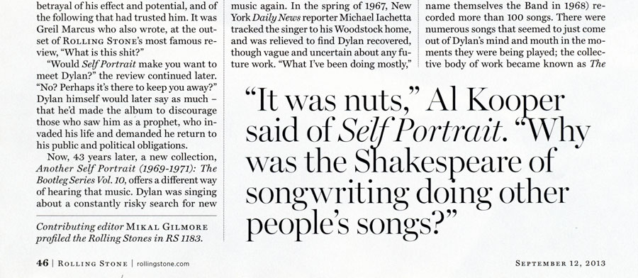
An intriguing quotation makes an excellent pull quote, as it entices the viewer to read on. This one is positioned within the grid, but its oversized treatment makes it stand out. Rolling Stone magazine.
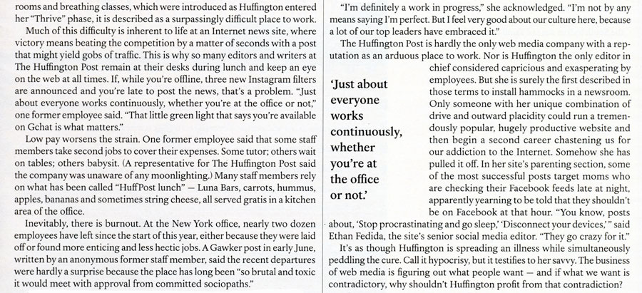
This randomly-aligned pull quote set in a contrasting font, with a green graphic element and generous white space, makes the text really pop. Fast Company magazine.
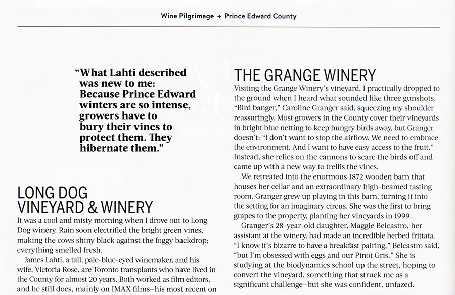
A top-aligned pull quote tucked in between a photo and a text column is easily noticed. Food and Wine magazine.
This not-so-large yet bold pull quote is floating in space, making it hard to miss. Food and Wine magazine.
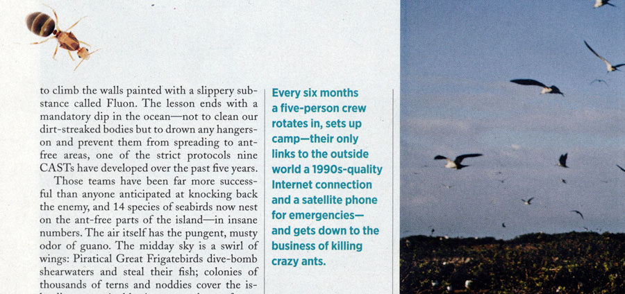
The addition of color makes these two examples really stand out from the neighboring text. Audubon magazine and House & Garden promotion.
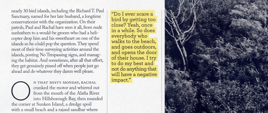
Yellow highlighting makes this pull quote, which is placed in-between black and white elements, jump off the page. Audubon magazine.
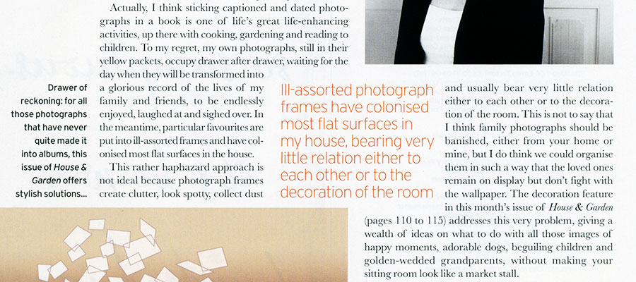
Placing this pull quote in-between several other elements creates an interesting geometric pattern. House & Garden magazine.
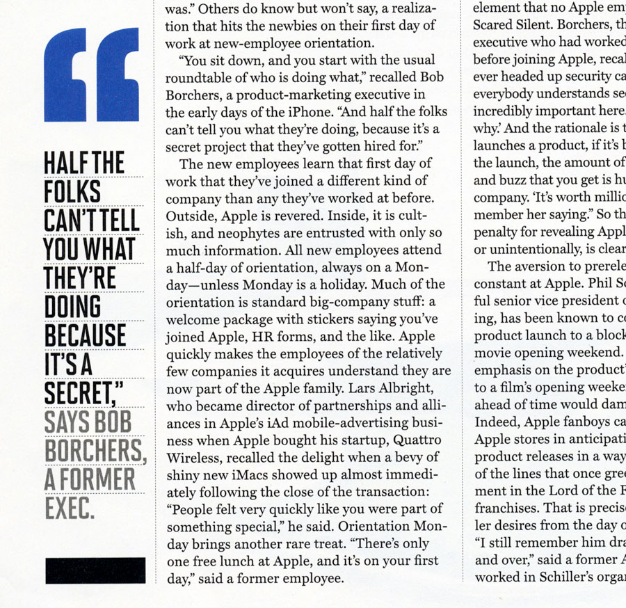
Oversized blue open quotes followed by two-toned, all cap text make for an exciting contrast to the dense text. Fortune magazine.
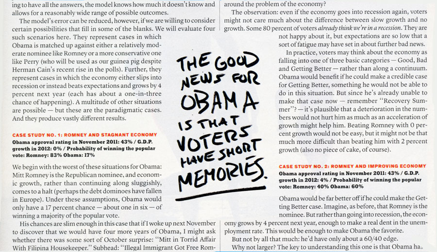
Want more drama? Try using all-cap marker hand lettering. The New York Times Magazine.
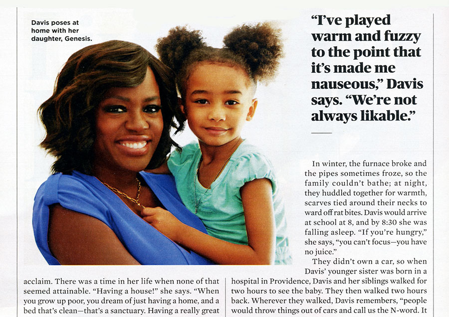
A nice interplay between a photograph and the subject’s quotation. AARP magazine.
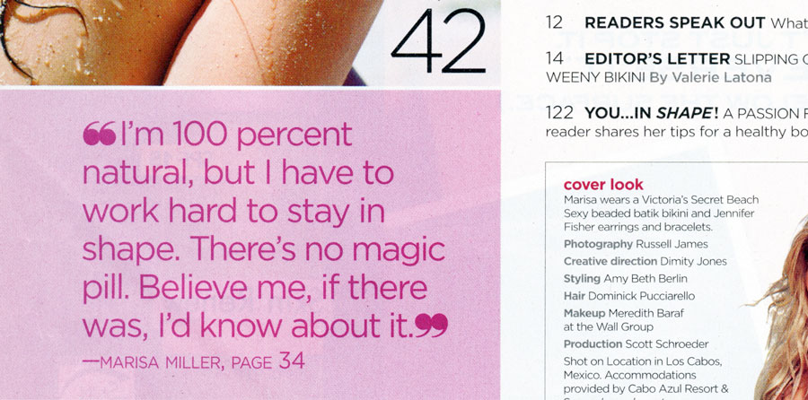
These two pull quotes use a lot of pink to speak to their audience. The second one is from the table of contents. Fast Company and Shape magazines.
The use of color, generous line spacing, and a corner bar graphic make this quotation very eye-catching. How Design magazine.
A very bold statement set in an equally bold treatment. Fast Company magazine.
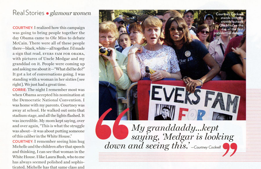
This pull quote is closely integrated with the photo of its author. Glamour magazine.
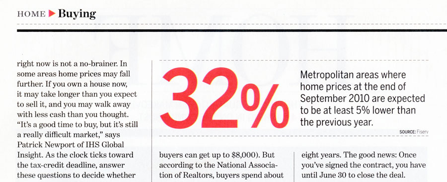
A dramatic treatment that highlights important information in red can be a convincing marketing technique. Money magazine.
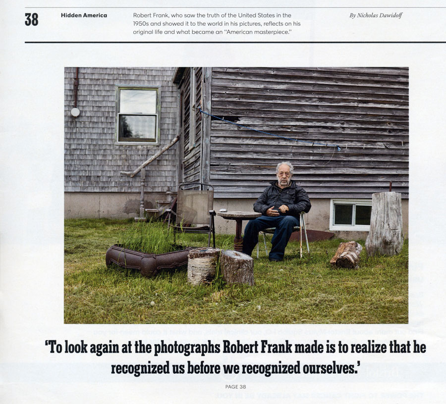
This quotation set in a strong, convincing style is a teaser for the actual article. Perhaps not technically a pull quote as it appears away from the actual article, but still worth noting. The New York Times Magazine.
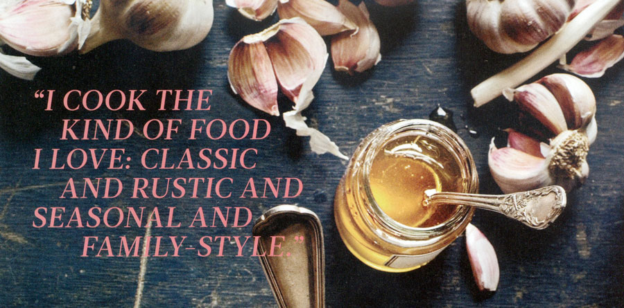
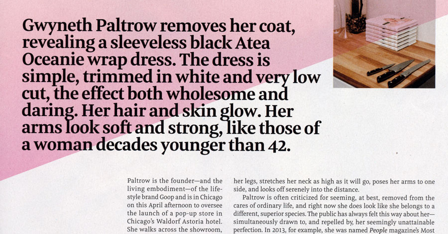
Pull quotes can also be placed on photographs, as in this editorial feature opening page. Food and Wine magazine.
Excelentes tips. Gracias.
Thank you for your advice and knowledge.
I am not sure where to place the pull quotes – before or after the original text?
The placement is related to what makes sense within the overall design, rather than the actual text. It is meant to draw a reader into the article, but I would place it on the same page or spread so it is connected and flows with the article.
Ilene
This is helpful information, and I appreciate that you included examples to get our creative juices flowing! (One small point, not meant as criticism at all–merely what I would want a reader to tell me, were I in your shoes: One line in your third paragraph contains an extra article: “as long as they express a complete a thought”)