Three Ways to Get an Image Inside Text
Recently, this question was posted on the InDesign forum at Adobe.com:
I’m apparently missing something that seems like it should be pretty straight forward. Working with CS3, using Vista, I’m trying to put an image “within” the structure of large bold type for a poster. I have placed an image on a bottom layer, then on another layer above that have put reversed out type (Paper swatch) within a solid block of black. The solid block of black completely covers the image on the underneath layer. I would THINK that the image below would just show through the type area but the reversed out type is just showing up as white. Am I missing something simple here?
The concept of what the “Paper” color means, exactly, can be confusing. As I replied to the writer, filling an object or text with Paper means that you want its contents to appear to knock out everything behind it, through the stacking order and through the layers, to the color of the paper upon which it’s printed. (And putting things on different layers doesn’t make a difference, so I won’t mention that aspect again.)
If you fill text with the Paper color and then print the file on brown craft paper, what looked white on screen (the default Paper color) will be brown in the printout — regardless of any other object it overlaps– because you’re supposed to see the actual paper color. This is why InDesign lets you edit the default Paper color to best match the color of the paper you’ll be printing on, so you can preview it on screen.
His question reminded me of a student’s frustration with the None color in a recent class. He wanted the exact same effect as the guy who wrote the post, and thought the solution was to fill the reversed-out type with the None color, instead of Paper. Nope — the None color just affects how the text fill interacts with the text frame’s fill, so you end up with invisible text on solid-filled text frame.
Let’s take a look at what they were trying, and then go over some ways to get what you want.
Here are two frames in InDesign (CS4, though this applies to CS3 too). One is an image, the other is a black text frame with Paper-filled text. This is what the forum poster was working with.
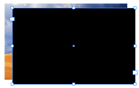
When you drag the text frame on top of the image (both frames are exactly the same size in this example, so I’ll offset the frame a bit), this is what you get:
If you change the color of the text to None, you get this beauty:
I swear, there’s text in there. ;-)
Okay, so those don’t work. How about some solutions?
The Knockout Group Solution
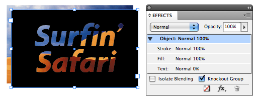
The first method that comes to mind was first explained by David in this post, which was an offshoot of a method that Pariah Burke came up with. The idea is that by 1) Making the text 0% opaque (just the text, not the object); and 2) Turning on Knockout Group (a checkbox at the bottom of the Effects panel) for the text frame, the result is that the text knocks out of the color of the text frame it’s in, but nothing else.
So anything behind the text frame can be seen through the “holes” made by the type. And the type is fully editable — very cool. Note that the Knockout Group attribute can be applied to a single frame, as above … it doesn’t have to be two or more grouped objects.
One problem with this method is that since the text is technically filled with nothing (0% opacity), you can’t apply some other effects to it that manipulate its fill color, like Bevel and Emboss or Inner Shadow. Effects that don’t need a fill, like Drop Shadow, work fine.
Since the poster specifically said that he wanted the text-filled-with-an-image to appear within “a solid block of black,” he has another method available, one where he could add any other Effect he wanted to the text.
The Multiply Frame Solution
You start with two objects: The image, and the Paper-colored type reversed out of a black frame. In other words, this guy again:
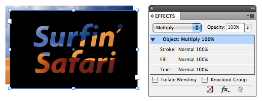
Drag the text frame on top of the image, and then change the text frame object’s Blend mode (in the Effects panel dropdown menu) from the default Normal to Multiply:
Why did this work? Because in the underlying algebraic equations of the Multiply Blend mode, pure black is like multiplying by 1 — it stays the same. Pure white (or Paper) is like multiplying by 0 — it disappears. All other pixel color values fall between 1 and 0, and so you see something new when two overlapping pixels are multiplied together. (I love the math behind the blend modes.)
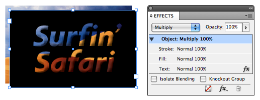
Since the text is technically 100% opaque, you can select the Text attribute in the Effects panel and apply any Effect you want to it. Here it is with Bevel and Emboss:
Because of the special properties of Black and White in Multiply Blend mode, this method only works with a solid Black text frame and Paper or White-colored text. If the text frame is filled with a different color, like green (left) or even None or Paper (right), you get this … which is pretty neat anyway.
Both of these methods, Knockout Group and Multiply Text Frame, allow you to keep the text live, so you can edit it, apply styles to it, and so on. There is another way to fill text with an image, but it requires you to convert the text to vector outlines (Type > Create Outlines), meaning it’s not longer editable. Unless you’re very very good with the Pen tool.
The Filled Text Outlines Method
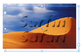
You start with two objects: An image and a text frame containing the text.
First, with the Direct Selection tool (the white arrow), select the image and copy it to the clipboard (Edit > Copy).
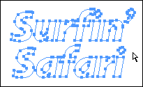
If you want all the text in the frame to be filled with the image, select the frame with the Selection tool and choose Type > Create Outlines. (If you want to fill just some of the text in the frame, select what you want with the Type tool before choosing the Create Outlines command.) Here’s Surfin’ Safari as outlines:
Select the outlined text with the Direct Selection tool (as I’ve done above, though you don’t need to select all the points) and choose Edit > Paste Into. If Paste Into is grayed out, you’re probably using the Selection tool instead of the Direct Selection tool. Also, if only a portion of the outlined text becomes selected, you may need to select all the outlined text at once by Shift-clicking with the Direct Selection tool and then choosing Object > Paths > Make Compound Path first, to “unite” the paths into one single object.
I made a compound path out of the two lines of outlined text for Surfin’ Safari. Then I selected the compound object with the Direct Selection tool and chose Edit > Paste Into. Here’s the final result, as seen in Preview mode:
While the text itself is not editable, you can still use the Direct Selection tool (hovering the cursor inside a letterform so it turns into the Hand tool) to select the image it holds and drag it around, revealing different parts of the image inside the outlined type. You can also select the outlined type with the Selection tool and apply an Effect to it … for example, our friends, Bevel and Emboss and Drop Shadow:






Type Tricks : https://www.indesignvideos.com/3.zip
Download it, open it and enjoy !
Cool stuff for sure and while I’m the first person to do something in InDesign “just because I can” this is one of those tasks that I generally outsource to Photoshop.
Save as PDF and place in ID.
Like Bob I tend to use Photoshop for this, but more because my customers want to get certain images for their sites or used in other projects, and I find it easier to have the PSD file ready for everything rather than messing with exporting from InDesign.
It’s good to be back at work, ’cause I can now finally visit this site again (I can’t get to it from home, no matter what I try). Too bad work also implies working and dealing with customers… ;)
A belated happy new year to everyone!
Well, the PDF route that Bob mentions is best. Simply because when you print a pdf the vectors are preserved, where as with a PSD the vector masks, shapes, etc. are rasterised on output (I’m nearly sure, it’s been 2 weeks since I’ve seen my beloved computer). If you supply someone a PSD file and they open it and make changes yada yada yada and save it again, place it in the layout and vectors are converted to raster on output only. Whereas if you gave them a layered PDF then they would be able to open it, edit the vectors and place it and print it with all the vectors printing as expected.
So Indesign can deliver the PDF just as Photoshop can, so it’s much of the same in my eyes.
The functionality is the same, the result is the same, the only thing that changes is how quick it is to do it in InDesign. Some systems can’t open more than 2 apps at a time (I know it’s a sad point).
Some people only deal with page layout and design and don’t have illustrator or photoshop. I have and know how to use both of the aforementioned apps, but I rarely ever have them open. I receive files and layout the content most of the time. I could probably get by without photoshop and illustrator, really.
I’m not saying that you shouldn’t do it in one app or the other. I’m just saying some people don’t have the means to open/work/use/etc. photoshop.
I think the tip is excellent and it negates the photoshop route which yields similar results and that’s the point wasn’t it? Using InDesign to get the result and showing that you don’t need to go to Photoshop for menial tasks (only menial when you know how :) )
I have to say though, I like having an actual image file to place, rather than a complex piece of indesigning, it’s just that it could clutter up the resources if you ask indesign to do too much.
Very, very cool! Thanks!!
Re multiply with black frame – don’t forget that for print output, 100K won’t be that black. With multiply, as per overprinted 100 black, the image will show through slightly. (prefs – ‘overprint black swatch at 100%’ can catch you out here, even if you aren’t multiplying the black over an image)
60C100K gives a better ‘dark black’ for print IMO…
David Blatner – You are the god of Indesign. I’ve been cracking my head on this for an embarrassingly long time – and here you have it, the world’s simplest solution. Thank you! Thank you! Thank you!
When I export to a PDF a design which uses the Knockout Group effect, it does not work at all, the text just assumes the colour of the box it was inside. If I open the PDF with acrobat the text is visible but on any other software, and when I print it, I just get a big box.
I have noticed a few people have this problems but nobody has yet solved the mystery?
Any Ideas?
@Barnaby: I’m not sure what the problem is, but one possibility: Are you using a spot color? If so, make sure Overprint Preview is turned on in Acrobat. Many of ID’s transparency effects require that. Search for overprint preview on this site to find more.
I have created a couple of lines of text, aligned towards spine. I highlight all the text and click “create outlines”, but when I go to choose it to place the picture, it will only allow me to choose one line at a time. It will not let me group them or shift-click them to select more than one. I cannot figure it out!! Please help?!
Do either of the first 2 methods work if you want something other than a black or white background?
Can you show an example of a custom color background that the photo image file will work for type that one would like as part of the image file? Thank you for your help. – Russell
While both options #1 and #2 worked fine in InDesign and seemed to print Press Ready PDF fine. When it’s is sent over in email, the type plugs to the surrounding color. Not sure why it did that.
Is there a better suggestion for Image Inside Text for a printing job?
Hi all, I am trying to use the create outlines method, but it’s not quite working the way I need it to because of a small twist I have added to the mix. I have created my outlined text on a path and each time I try to use the “paste into” method, it pastes the image into the path itself, and not the outlined text. Is there a workaround for this?
Thanks!
Knockout saved me, thank you