What is That Weird “A” Bullet Character in the Dialog Box?
Krissy wrote:
Does anyone know what that bullet symbol with the A is called? And why anyone would use it as a bullet?
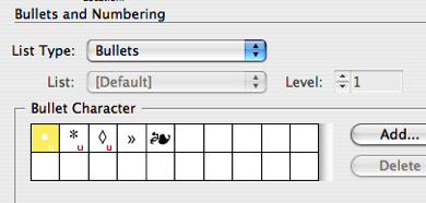
About half of the world’s InDesign users know what you’re talking about, and half have no idea because they see the bullet correctly! For those in the latter camp, Krissy is talking about this:

See that bullet character highlighted in the Bullets and Numbering dialog box? That’s what I see, too. But a lot of InDesign users don’t see that… instead, they see:

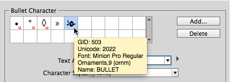
Oh! That character in the fifth spot makes a lot more sense, doesn’t it?! Kind of lovely flourish bullet. Too bad it doesn’t work for the rest of us.
Technically the weird “A” character is Unicode 1F88, a.k.a. the Greek Capital Letter Alpha with Psiili and Prosgegrammeni. (If any readers can explain what that character is or why anyone would want to use it, please comment below!)
This mismatched character problem has been showing up for several years, and I finally figured out what the problem is, with the help of the amazing Thomas Phinney.
The problem comes down to font versions. Most people don’t think about fonts having versions, but they do! Whenever a font foundry creates a new version of a font, they give it a new version number, but almost no one ever pays attention to that. You can usually see it by choosing File > Get Info (Mac) or Properties (Windows). Even easier, you can choose the font in the Type > Find Font dialog box and click the More Info button:

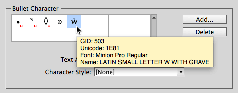
If you look closely, on the 5th line, you’ll see that this version of Minion Pro is 2.112. But when I do a search on my computer, I find a bunch of different Minion Pro Regular fonts. If I install 1.021 from 2003, I get this kind of bullet:

Isn’t that crazy?! It’s a totally different Unicode character. Then, when I install a different copy of 1.021, from 2005, I get this:

There we go! That’s what I wanted. But this is yet another, different Unicode character.
So what’s going on? Well, look at the GID number in that tool tip above… yes, the GID is the same. The GID is the “glyph ID number.” So, my best guess is that many years ago some Adobe engineer decided he or she wanted that floral bullet. Unfortunately, that character doesn’t have its own special Unicode value (it shares the same value as many other “bullet” characters) so the engineer decided to base the bullet character on the GID value — kind of like saying “just choose the 503rd character in Minion Pro.”
That was all well and good until a new version of Minion Pro came out, where the characters (glyphs) were encoded slightly differently. Ooops.
Solutions
There are a number of solutions for this problem, including finding an older version of the font and putting it in your document’s “Document fonts” folder. But my recommendation is simpler: Select the character in the dialog box and click that little ol’ Delete button to get rid of it.
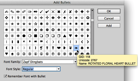
Then click Add and select yourself a new bullet character from a different font. If you want that floral bullet, you can find a very similar one in Zapf Dingbats:

Mystery solved.


Generally speaking — it’s an old version of Greek A letter with different pronunciation, that is not used in typography nowadays.
«In traditional («polytonic») Greek orthography, vowel letters can be combined with several diacritics, including accent marks, so-called «breathing» marks, and the iota subscript. In common present-day usage for Modern Greek since the 1980s, this system has been simplified to a so-called «monotonic» convention.»
Mr. Serge: Wow! Thank you, or should I say Σας ευχαριστώ
No problem. And, by the way — my native language is Latvian and I have no idea how to read Greek.
re: ‘not used in typography nowadays’. Those of us who typeset classical, hellenistic, late antique, mediaeval, or early modern Greek — in fact, almost any Greek literature up to the middle of the twentieth century — do use the polytonic system and are profoundly grateful to type designers who provide the glyphs that make this possible. I am particularly fond of Robert Slimbach’s Arno Pro with its beautifully harmonised Greek and Latin glyphs.
To those who like this sort of thing, I suggest having a look at Anagraphi Fonts. LTM
When I was at my favorite local Greek restaurant the other night, I believe the special was Psiili with Prosgegrammeni sauce. Ancient recipe.